How to judge a book
A little show and tell.
As I said in a comment to my last post, reading the content is 'only a small part of what I want to do with a book'. I have no truck with the Platonic injunction never to judge a book by its cover, because it relies on a too easy separation of form and content, body and soul, to the discredit of the former. Just as one shudders to drink wine from a paper cup, or eat a fine steak with plastic cutlery, so one is ashamed to have one's Joyce or Shandy in an ugly classics edition, let alone on the screen. None of us here has a problem with the taste for fine volumes. But what constitutes a fine volume? If you are going to have a fine Aristotle or Cicero, a lavish eighteenth-century edition in gilt calf is undoubtedly the way forward, for those who can afford it. But what of those modern (or even pre-modern) authors who refuse to be manifest in gilt calf?
Myself, I favour the browned dustjackets, attractively limned in black and red, that flourished in the middle of the last century, especially in the 1940s. Here, for instance, is my 1948 copy of Nashe's The Unfortunate Traveller, which had previously appeared only in period pamphlet form, or else in buckram-bound Workses of 1833 and 1904:

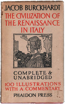
The layout of the cover loosely imitates a standard Elizabethan title-page (though not Nashe's), gently modernized. Ayrton's image illustrates Nashe's account of the 'sweating sickness' that broke out in London in 1517: 'This sweating sicknes, was a disease that a man then might catch and never goe to a hot-house. Manie Masters desire to have such servants as would worke till they sweate againe, but in those dayes hee that sweate never wrought againe.' An apt reference, given the sudorific humidity currently plaguing London. Here, again, is a 1945 Phaidon edition of Burckhardt:

The materials are the same—cheap paper, red and black ink—but the effect is quite different, largely due to the crabbed inscription-capitals of the title, and to the Quattrocento woodcut. (Can anyone identify it?) Best of all in the genre, though, is undoubtedly this, sadly a reprint, but an authentic one, which I once picked up in the rare books department of the famous Strand bookstore, NYC:

I find it virtually impossible to dislike the Menippean contents of this volume, no matter how light the Surrealists' literary talents might have been. The design is a modernist masterpiece. How much variety can be obtained from these jackets, so simple and elegant. I wonder if their progenitor is the marvelous cover of the Kelmscott Chaucer. Certainly, there is not enough design any more: so many modern books, even when they've been well budgeted to look handsome, resort to photography or, worse, a famous painting in the adornment of their covers. Such recycling, at its best, can be clever, but like Eco's novels, it demonstrates the sad triumph of erudition over imagination.
As I said in a comment to my last post, reading the content is 'only a small part of what I want to do with a book'. I have no truck with the Platonic injunction never to judge a book by its cover, because it relies on a too easy separation of form and content, body and soul, to the discredit of the former. Just as one shudders to drink wine from a paper cup, or eat a fine steak with plastic cutlery, so one is ashamed to have one's Joyce or Shandy in an ugly classics edition, let alone on the screen. None of us here has a problem with the taste for fine volumes. But what constitutes a fine volume? If you are going to have a fine Aristotle or Cicero, a lavish eighteenth-century edition in gilt calf is undoubtedly the way forward, for those who can afford it. But what of those modern (or even pre-modern) authors who refuse to be manifest in gilt calf?
Myself, I favour the browned dustjackets, attractively limned in black and red, that flourished in the middle of the last century, especially in the 1940s. Here, for instance, is my 1948 copy of Nashe's The Unfortunate Traveller, which had previously appeared only in period pamphlet form, or else in buckram-bound Workses of 1833 and 1904:

The layout of the cover loosely imitates a standard Elizabethan title-page (though not Nashe's), gently modernized. Ayrton's image illustrates Nashe's account of the 'sweating sickness' that broke out in London in 1517: 'This sweating sicknes, was a disease that a man then might catch and never goe to a hot-house. Manie Masters desire to have such servants as would worke till they sweate againe, but in those dayes hee that sweate never wrought againe.' An apt reference, given the sudorific humidity currently plaguing London. Here, again, is a 1945 Phaidon edition of Burckhardt:

The materials are the same—cheap paper, red and black ink—but the effect is quite different, largely due to the crabbed inscription-capitals of the title, and to the Quattrocento woodcut. (Can anyone identify it?) Best of all in the genre, though, is undoubtedly this, sadly a reprint, but an authentic one, which I once picked up in the rare books department of the famous Strand bookstore, NYC:

I find it virtually impossible to dislike the Menippean contents of this volume, no matter how light the Surrealists' literary talents might have been. The design is a modernist masterpiece. How much variety can be obtained from these jackets, so simple and elegant. I wonder if their progenitor is the marvelous cover of the Kelmscott Chaucer. Certainly, there is not enough design any more: so many modern books, even when they've been well budgeted to look handsome, resort to photography or, worse, a famous painting in the adornment of their covers. Such recycling, at its best, can be clever, but like Eco's novels, it demonstrates the sad triumph of erudition over imagination.
*
Buying attractive editions of cherished books poses no problem. I feel less comfortable when I come across a work with beautiful covers but no interest between them. I have vacillated, in my collecting days, in my opinion on owning a book purely for its pretty face. I try to stand firm, the rationalist and Platonic collector. But now and then I have bowed to the lure and allure of physical beauty. For instance with books of poems, purchased despite my intense hostility, or at best indifference, to most poetry.

An undated (ca. 1900) George & Harrap edition of Browning's Pippa Passes, in limp plum suede with Nouveauish gilt and stamping—only three pounds last summer. The poem is infamous for its hilarious misuse of the word twat—amply covered by Language Log.

A 1958 New Directions paperback of Ferlinghetti which I 'borrowed' from my parents: the cover photograph is simply astounding, and the typography inside is a treat. Shame about the words ('Kafka's Castle stands above the world / like a last bastille / of the Mystery of Existence'). This was already the end of the line for modern poetry.
You notice the contradiction. At the beginning of this post I denied Plato and the strict separation of form from content, and yet now I happily disengage brilliant jackets from their puerile wearers. Wie gliet ich auß! Is it possible that the face could change my opinion of the mind?

I fear that if Crow, above in its 1970 first edition, were packaged differently, I might find it equally as tepid as the rest of Hughes' works. (And I pray that I never stumble upon a well-designed volume of Plath.) At times the adolescent sophisms sink to Ferlinghettiesque levels:
So finally there was nothing.But then there are moments of amusement, or better sophisms, at least:
It was put inside nothing.
Nothing was added to it
And to prove it didn't exist
Squashed flat as nothing with nothing.
And what loved the shot-pelletsIt ain't poetry, but moments like this chime with that grotesque, Dubuffetian cover drawing by Hughes' buddy Leonard Baskin, so pathologically hostile to the prettiness of poetry-lovers: the antitype of Pippa Passes and A Coney Island. It is therefore fitting that the cover evokes the raw elegance of the old mid-century covers shown above, black and red on matte paper. We don't need subfusc suede or glamorous photography, it says; only a simple graphic. And that cover gives wings to the words, epea pteroenta, that struggle to sing inside.
That dribbled from those strung-up mummifying crows?
What spoke the silence of lead?
Crow realised there were two Gods—
One of them much bigger than the other
Loving his enemies
And having all the weapons.
I leave you with two other favourites in my collection, bad books with terrific jackets. And which two books could possibly be more different?

A bizarre tragedy by Queen Victoria's novelist of choice, in a 1937 Methuen edition, which I acquired from a Charing Cross vitrine solely on the strength of its cover. The spine features what seems to be an exploding atom rendered as the Japanese naval ensign: oddly prescient, in its symbolic way, of coming atrocities. The cover photograph—date uncertain—shows Clovelly High Street, which remains little changed to this day. The dedication is 'To those self-styled 'progressivists', who by precept and example assist the infamous cause of education without religion and who, by promoting the idea, borrowed from French atheists, of denying to the children in schools and elsewhere, the knowledge and love of God as the true foundation of noble living, are guilty of a worse crime than murder'. And so the novel itself is a work of sickly piety, a sermon that the new science is not, after all, incompatible with the old religion: that the Atom is God.
It is important to read these sorts of books now and then, mixed in with your modern classics. One needs to acquaint oneself with the clumsy and hard to understand—with the Sylvie and Brunos as well as with the Snarks and Alices. In this case I found the wormwood of the message sweetened the over-writing, and by the magical primitivism of the jacket design. And then, from the rear to the advance-guard, a French atheist and 'progressivist':

A 1958 Gaberbocchus first edition, in cute saffron cloth, of the well-known Exercices des Style in Barbara Wright's translation. You can pay 200 dollars for one of these on abebooks, but I picked up mine for 50p in a library sale at the University of York. The title-page is of some interest: it reads, for some reason in French, Exercices de Style par Raymond Queneau. Someone has crossed out the 'c' in Exercices and written 's' in red pen, likewise replacing 'de' with 'in' and 'par' by 'by'. The work itself is juvenile: a smirky gimmick that could have been, and probably was, tossed off in a couple of hours—but it has some charm as a period document, conjuring that noman's land after Surrealism but before the OuLiPo, when the French avant-garde were trying desparately to find their feet again. Again, the cover design, with its jazzy doodles and parodic portrait, is the perfect essence of Queneau's literary spirit.
Now, what are your favourite covers?


